WEWORK
Strong visual design and structured user flows
Novel Office offers managed and flexible workspaces for businesses across Bengaluru. I worked on redesigning the digital experience around how people explore these spaces, from restructuring the information architecture and navigation to making the content easier to scan, compare, and understand.
Users struggle to understand workspace offerings, compare options, and take action due to unclear navigation, lack of pricing transparency, and overwhelming information.
To design a seamless and intuitive website experience that enables users to easily explore and inquire about office spaces.


A short online survey was conducted with 20 respondents who had previously searched for office spaces, to understand user behavior and expectations.
Strong visual design and structured user flows
Clear presentation of workspace offerings
Limited pricing visibility across most platforms
Heavy reliance on inquiry-based conversion
Create a more intuitive and streamlined experience that simplifies decision-making and reduces friction in user journeys.
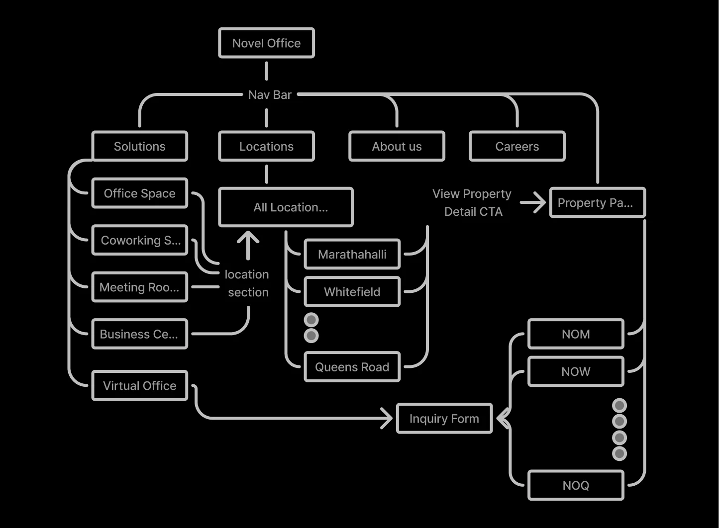
The site architecture maps the full navigation structure, from solution pages and location listings to property detail pages and conversion flows, ensuring every user path leads to a clear next step.
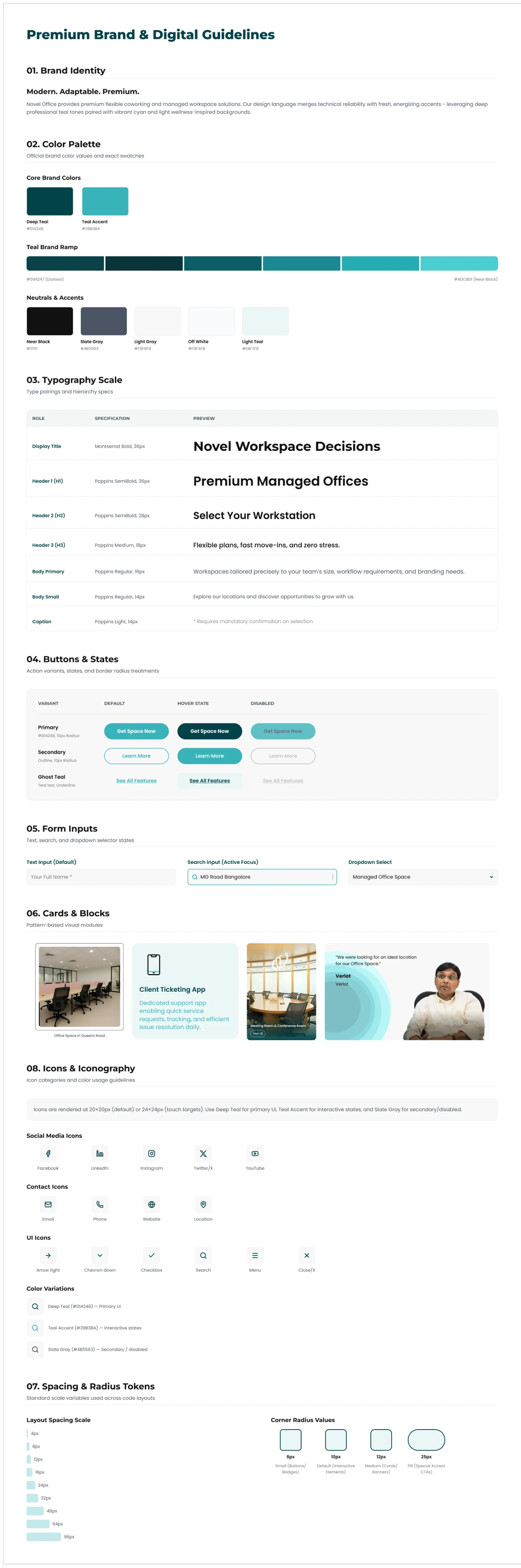
The design system defines the typographic scale, color palette, component library, and spacing tokens used across every page of the redesigned Novel Office website.
The live production screens below cover the full site: homepage, solution pages, location listings, individual property pages, careers, and about. The site is live at noveloffice.in.
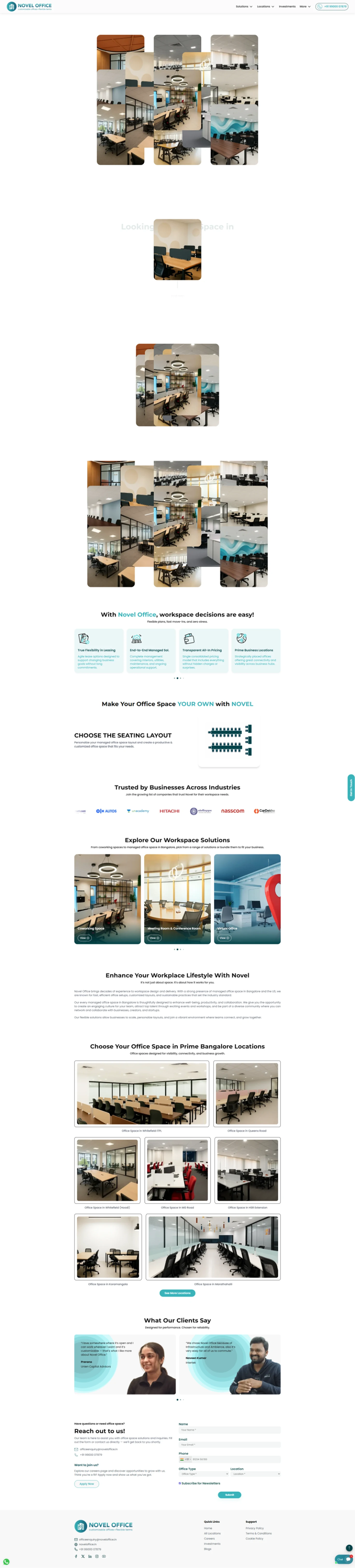
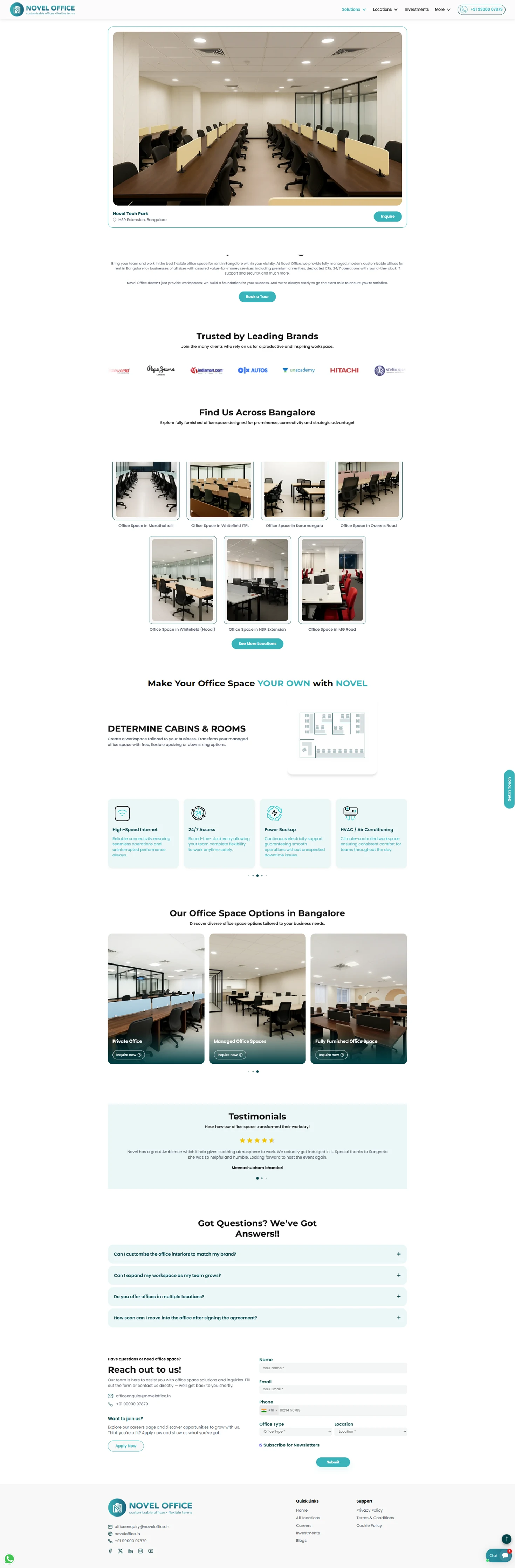
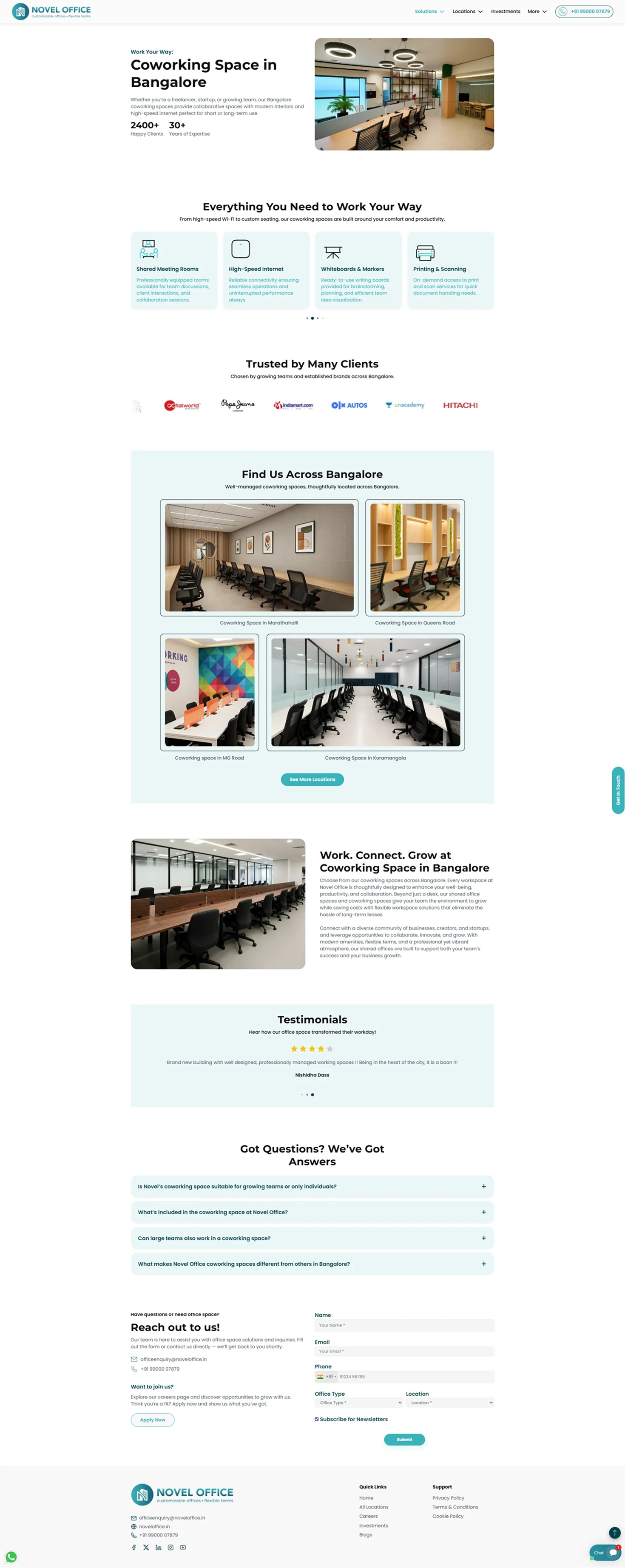
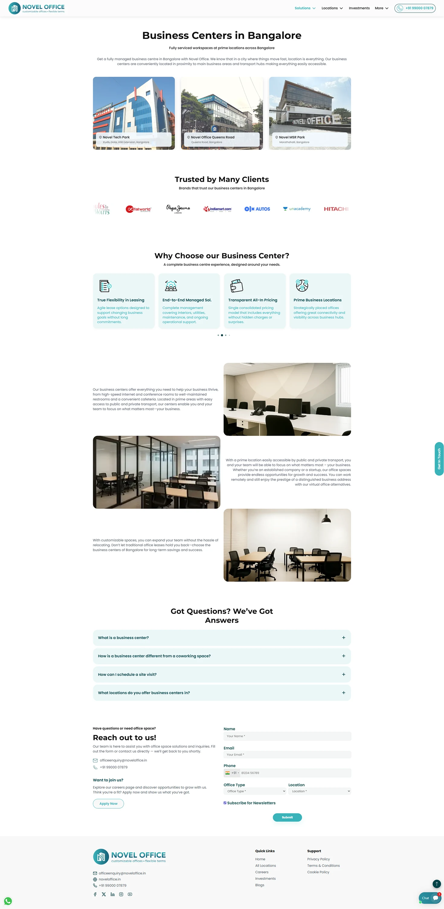
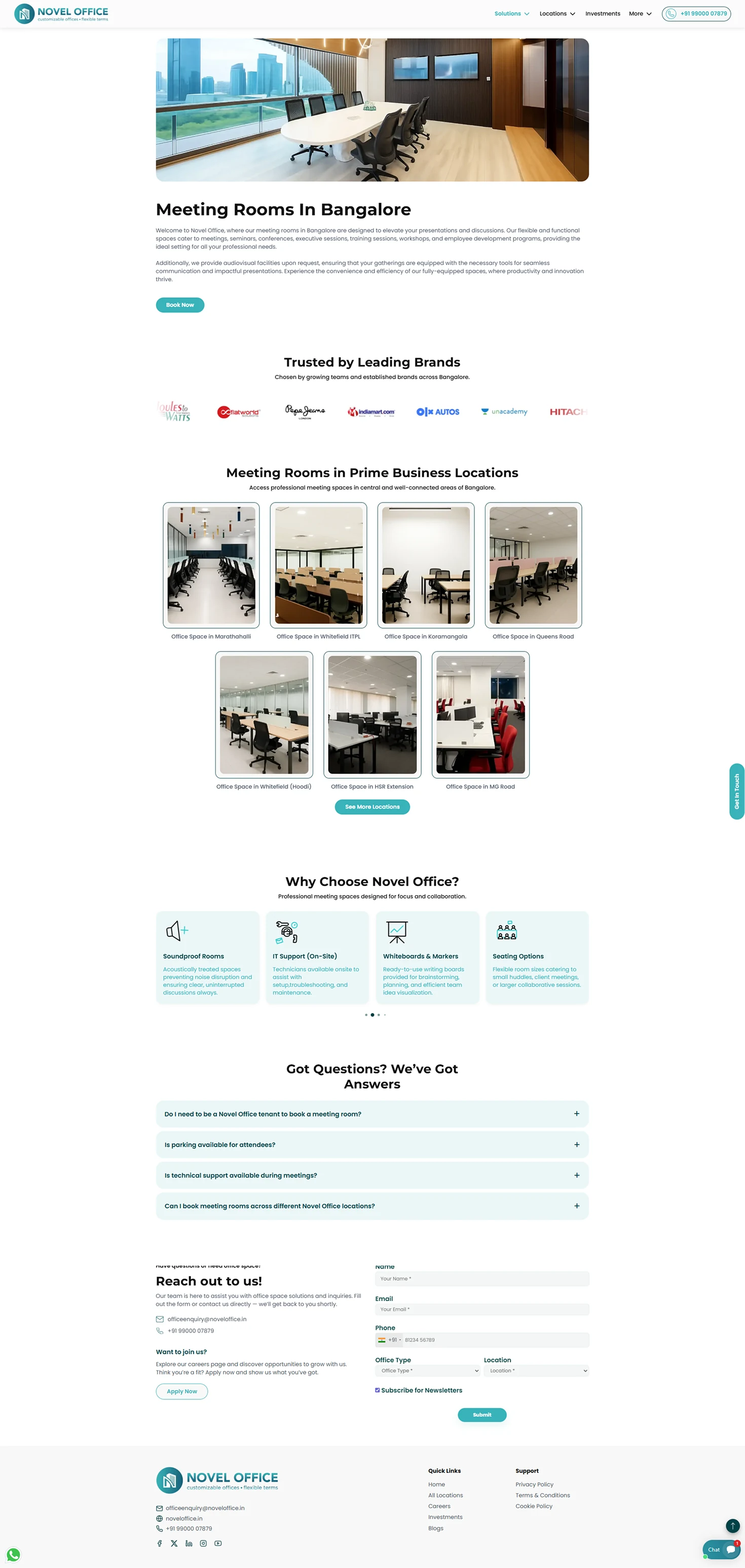
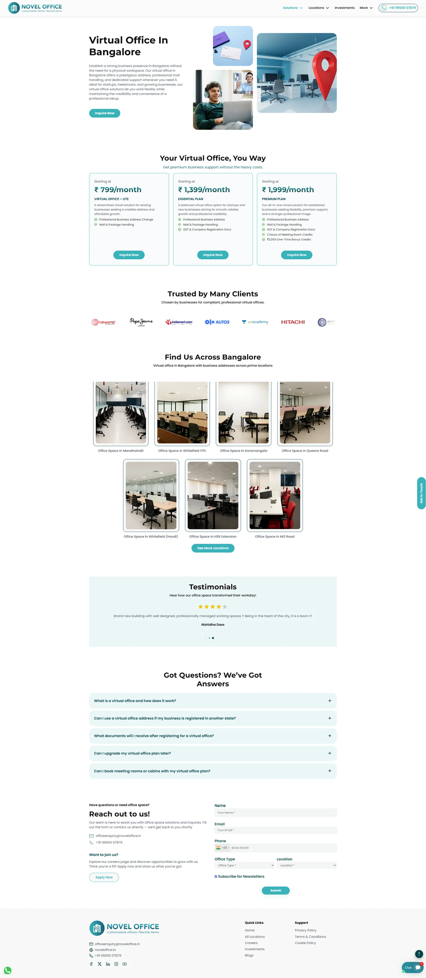
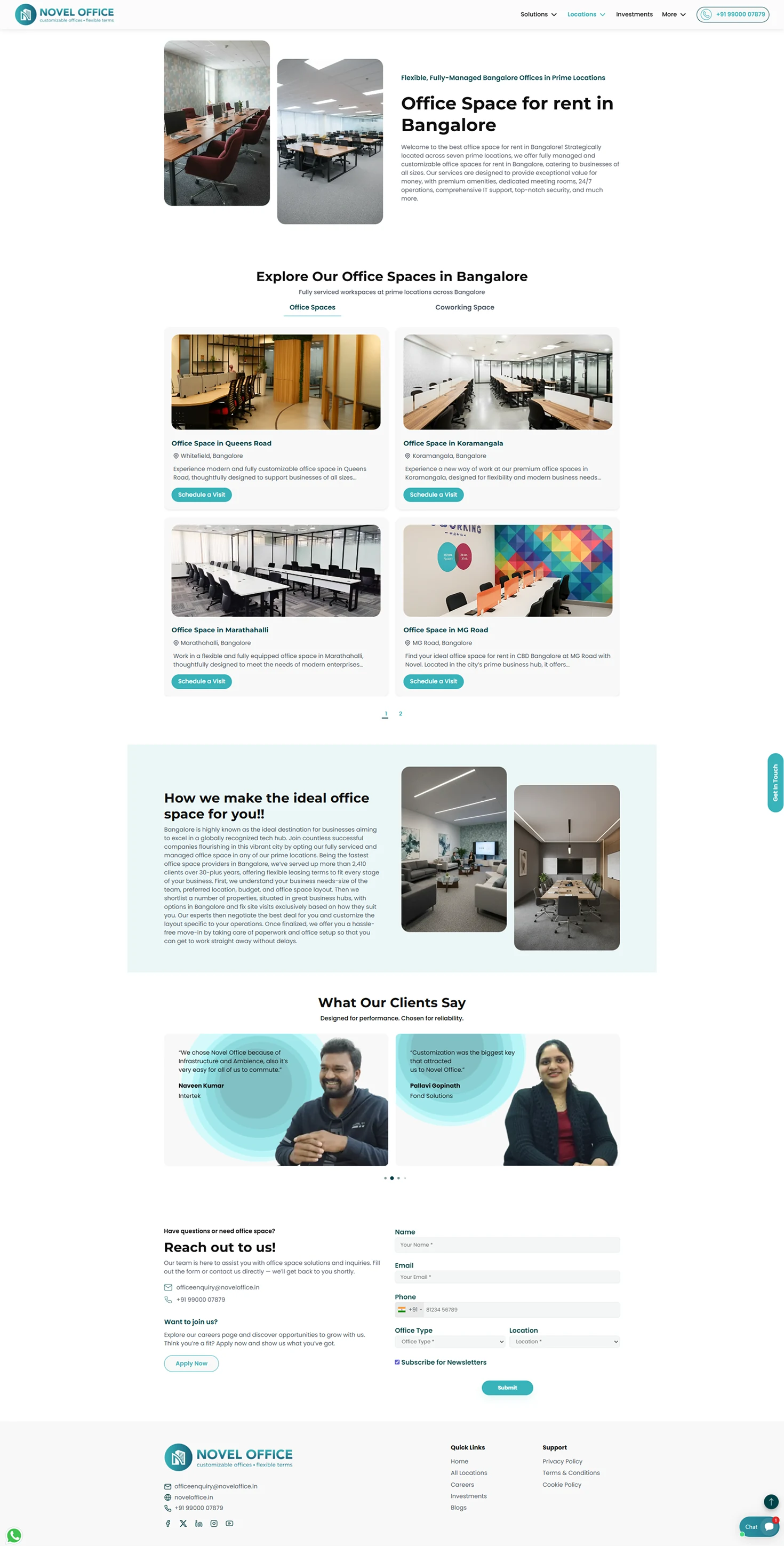
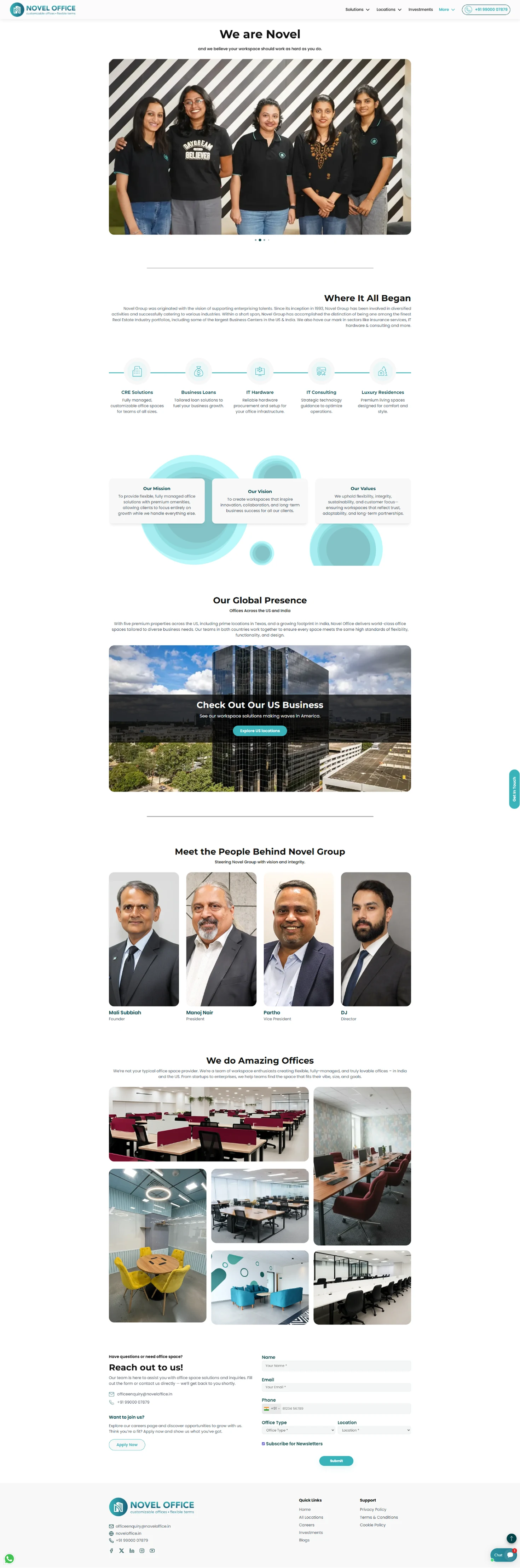
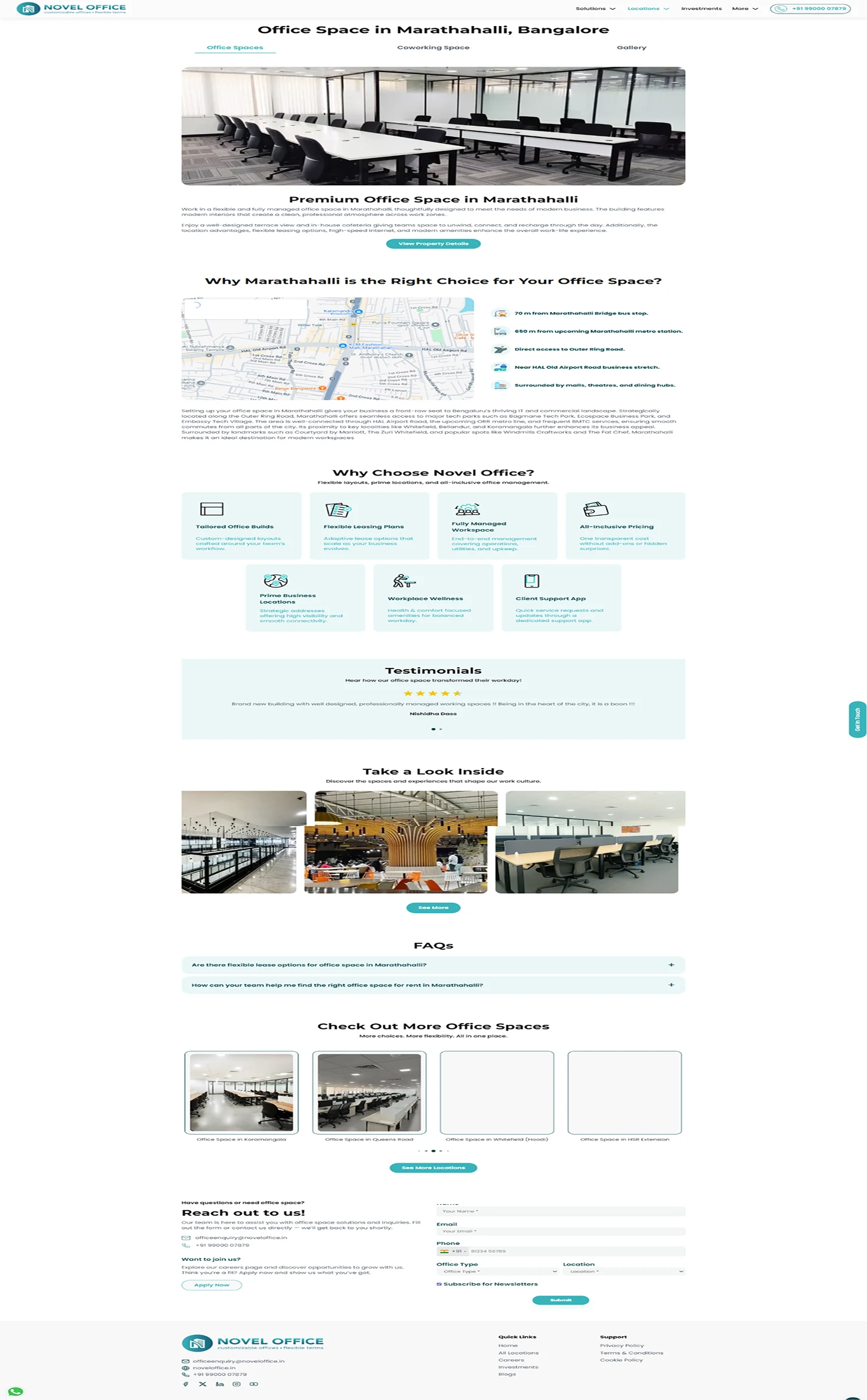
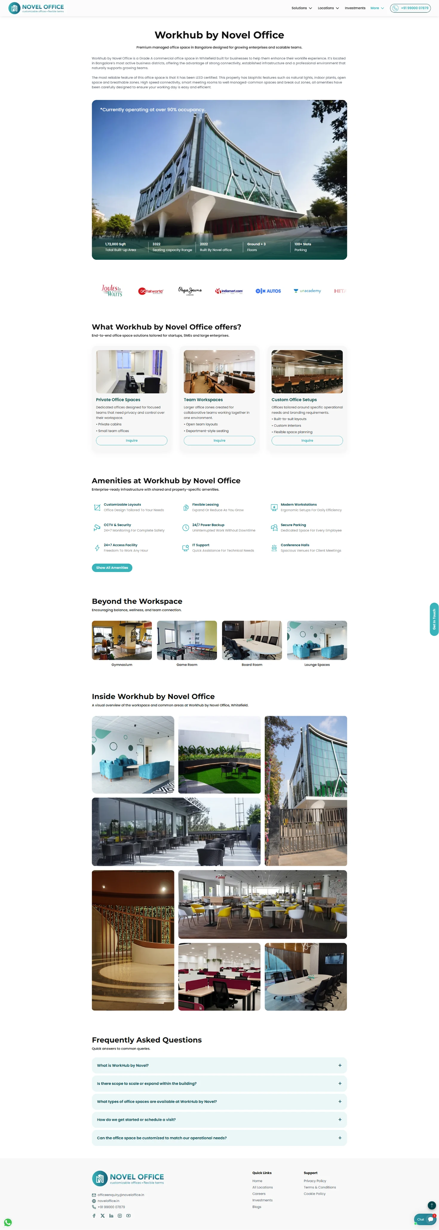
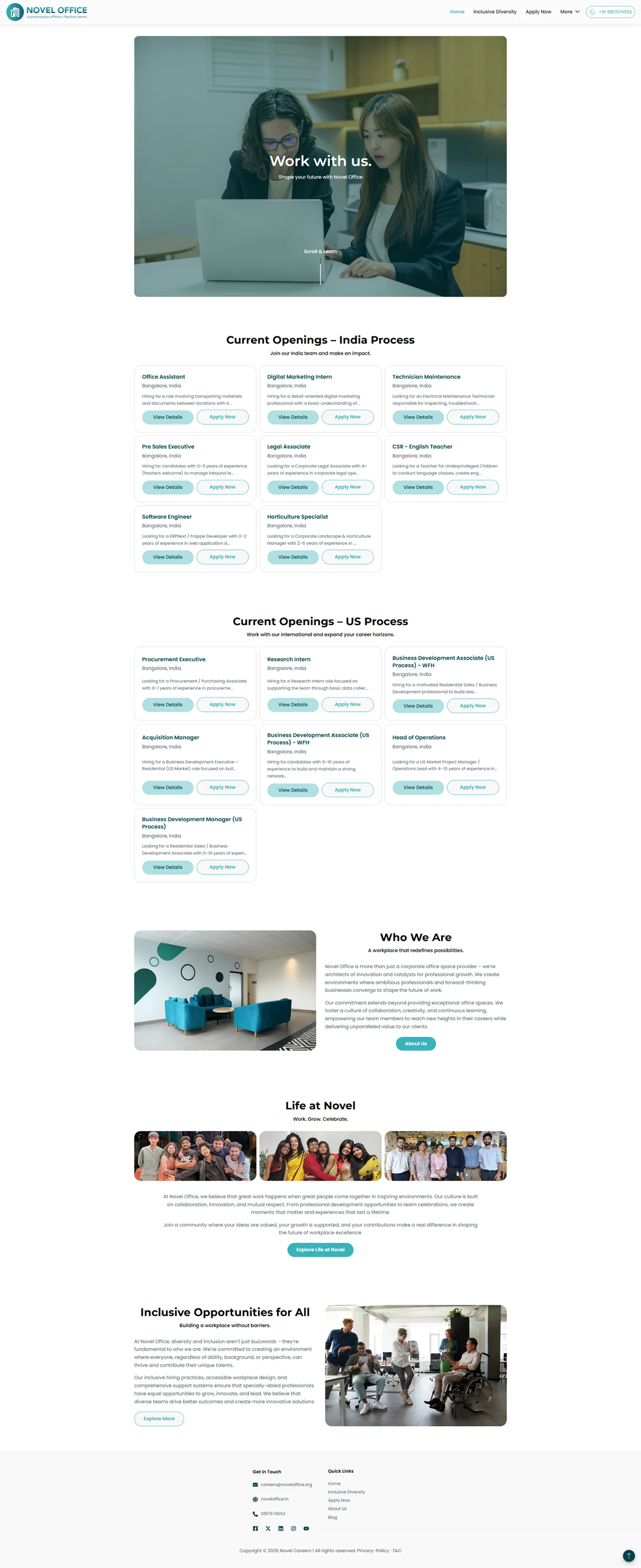
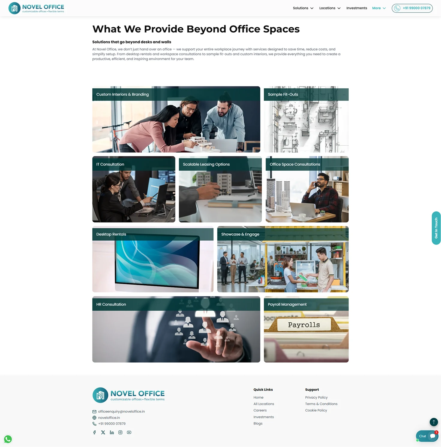
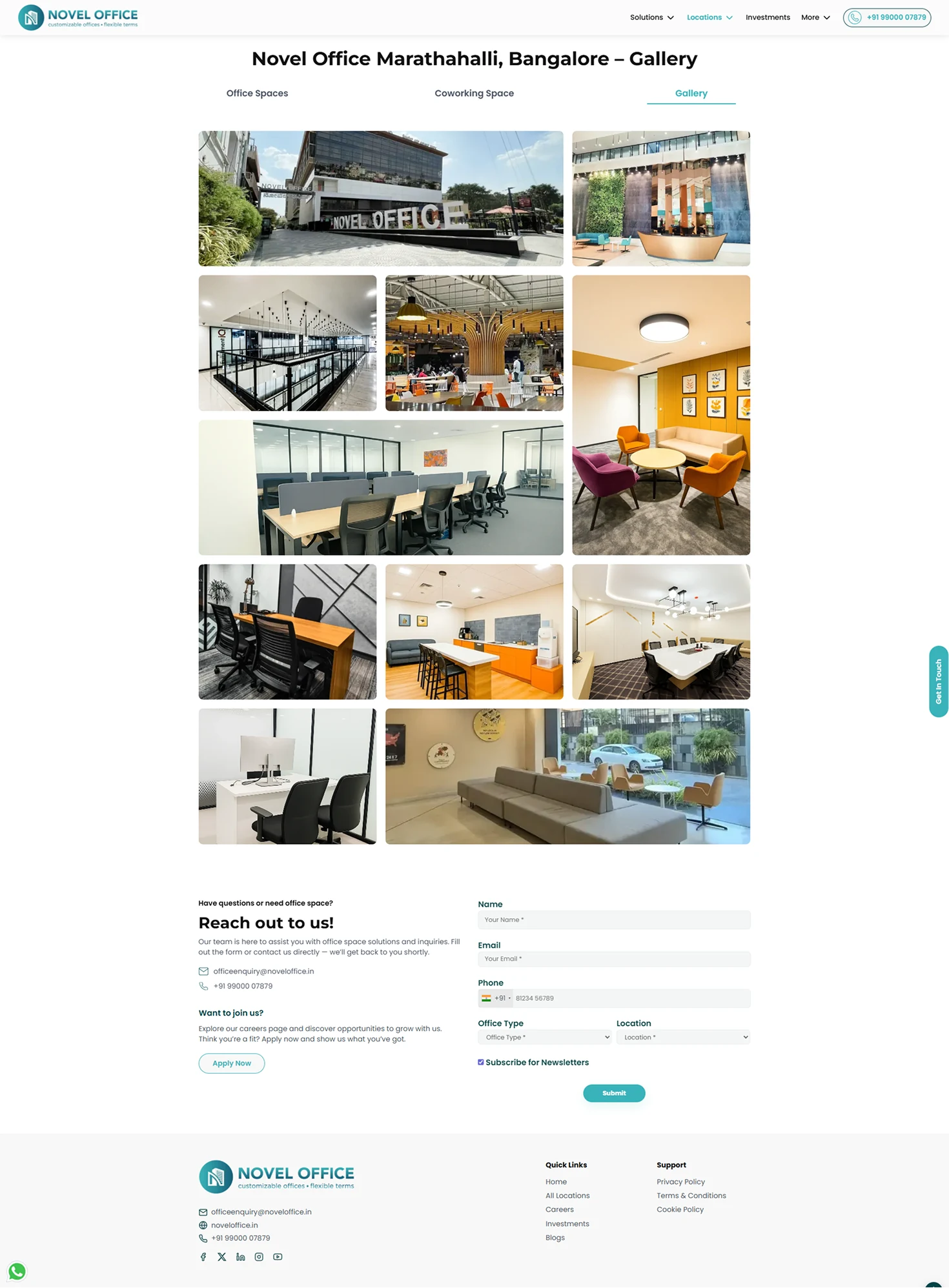
This site is live: Novel Office
Novel Office had an established visual identity and a specific audience, so the challenge wasn't simply creating a visually appealing website. I had to translate the brand's personality into an experience that felt clear, trustworthy, and easy to navigate
Speaking to users and looking at competitors helped me understand what people actually needed when evaluating an office space, from understanding the spaces available to finding the right information quickly. This helped me prioritize content and structure instead of designing purely from a visual perspective.
Working through the IA made me realize how much a website's usability depends on what comes before the visual design. Organizing spaces, services, locations, and information into a logical structure made the final interface much easier to build and navigate.
Defining typography, colors, components, and visual patterns before building out the pages helped maintain consistency across a large number of screens while still allowing each page to have its own purpose.
Test the redesigned website with potential customers to validate navigation, content hierarchy, and key journeys.
Measure whether users can easily move from exploring office spaces to taking action, such as enquiring, scheduling a visit, or contacting the team.
Use analytics and user feedback to identify drop-off points and improve high-traffic pages and conversion paths.
Continue developing reusable components and responsive patterns as new pages and features are introduced.